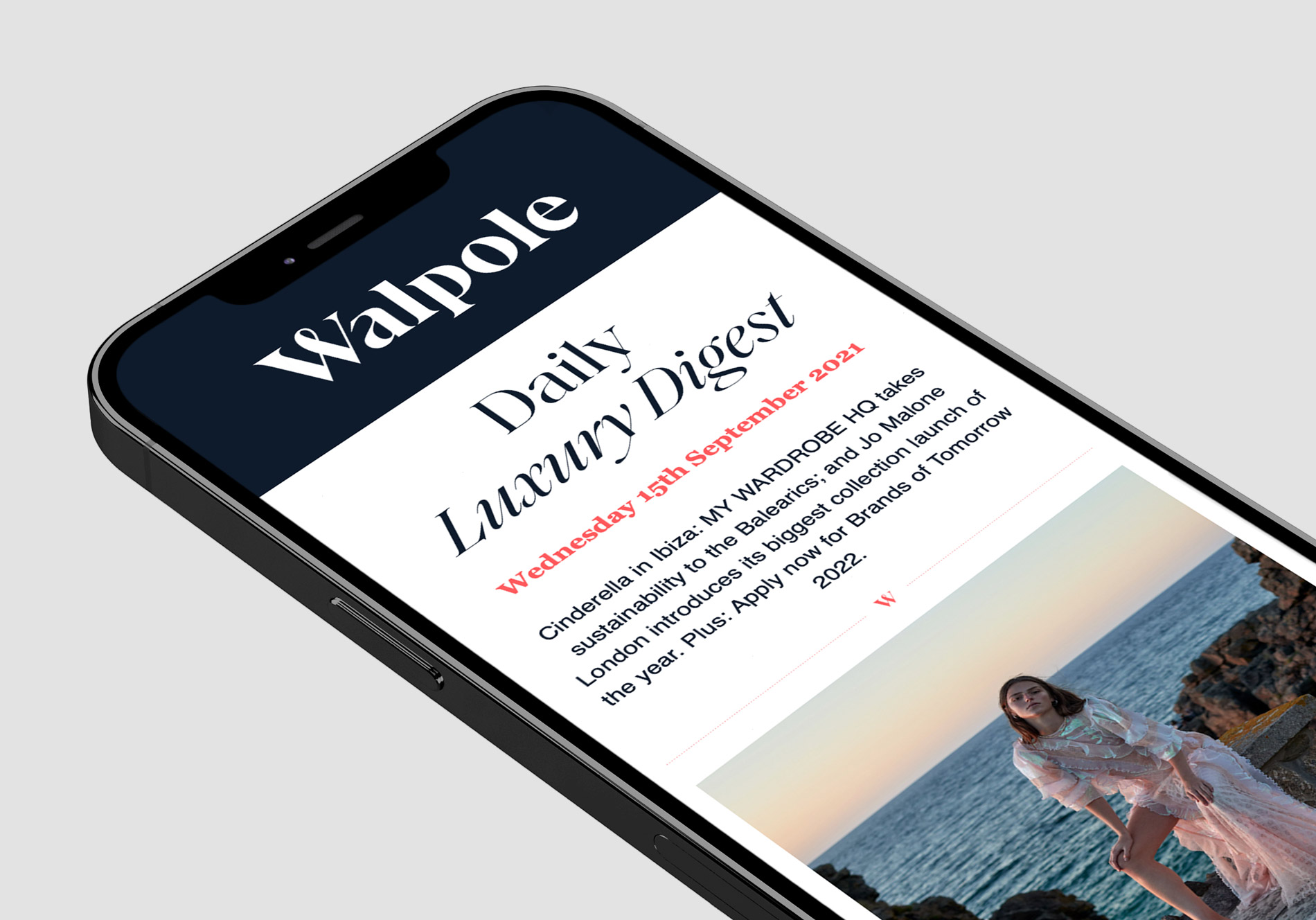
In the week of launch, we meet the partners who have been instrumental in bringing this year's book to life, and in the weeks and months to come we will share the editorial and brands featured within its pages.
We begin with a focus on the book's designer, the ever-brilliant Neil Tookey, Partner at Nous, who has transformed the book in the three years he's been at the helm of its design. Here, he discusses why every successful book needs a 'chorus, verse & bridge', the sensory appeal of beautiful paper, and working with Walpole members on the cover art to create something truly unique.
Can you tell us about the design process around the Walpole Book of British Luxury?
When I was approached by Walpole to propose a refresh of the book, my first task was to review the existing format and decide what I wanted to keep and what I felt needed revising. The book is one of the primary touchstones of the Walpole content strategy and I felt it important that the Walpole corporate identity should continue to be deployed to ensure the link with the brand was obvious and evident. I also saw no reason to change the proportions – it’s a mighty tome and this gives the publication great presence, which is important for an annual - after all this might sit on a lobby coffee-table for eight months. However, I felt that the content required a radical reorganisation to provide more clarity and impact. A successful publication requires a change of pace within its many pages. Like a popular song, it needs a chorus, verse & bridge. A great book or film can’t be ALL action – they need some suspense and expectation to break things up, otherwise it’ll be a wall of noise.
As for the layouts, luxury isn’t chock-a-block or super-busy, there needs to be some space – white space – to allow for elegance and contemplation. So the publication needed to feature changes in intensity and layout flexibility to allow for the reader to feel like the landscape is changing and experience an element of surprise when they turn the page. To deliver this initiative, I proposed the use of flexible grids, stock changes and imaginative use of photography and drawings when illustrating the stories.
One of the defining truths about the luxury sector is that a luxury purchase is an emotional purchase, and to pique the senses, we look to employ tactile papers and stimulating finishes to help reflect the quality and craftsmanship of the products and services discussed within the book."
The book has a superb pedigree of writers that comment on the sector with great sagacity and intuition. This state-of-the-union chapter of editorial makes up the opening half of the book. The other major element is the Luxury Index – an A-Z of brands telling their story in their own words. These sections are separated by one of my favourite segments of the book – The Numbers – the industry statistics delivered as a clear set of impactful valuations and percentages, all presented in simple one-colour silver ink on a dark blue paper. This forms important visual-punctuation in the running-order of the book.
This brings me on to one of the most-important features of the book design – the use of different paper-stocks to help sign post the sections of the book. One of the defining truths about the luxury sector is that a luxury purchase is an emotional purchase, and to pique the senses, we look to employ tactile papers and stimulating finishes to help reflect the quality and craftsmanship of the products and services discussed within the book. The physical elements involved in the marketing and delivery of products in the luxury sector are key to communicating rarity and high-craft. The sensory appeal of beautiful packaging, printed collateral and the details such as swing tags all define the caste of a brand – it’s something almost impossible to convey online – the printed/physical element is vital in the premium and luxury field. It’s these principles that dictate our approach when utilising different paper stocks with the book to define the chapters, for 2020 the opening editorial is printed on a tooth white uncoated that delivers bulk (Nautralis Absolute White), the Luxury Index is reproduced on a sophisticated highly matt coated paper (G . F Smith Max White), separating these is small section of a regal deep blue super-matt paper (Plike Dark Blue) which ensure the silver stats really pop off the surface. To deliver this we are lucky-enough to partner with G . F Smith, the most exciting paper merchant in the world. They have a fantastic array of fine papers that can be used within the lithographic print process.
What can you tell us about the production process of the book?
The book takes about three months to plan, asset-source and layout. We begin early November with the goal of going to press mid-Feb. We split the production of the content up into two parts, with the Luxury Index created first, and then all the supporting editorial designed after New Year. A number of the editorial stories commissioned for the book give a subjective, philosophical viewpoint on luxury – it can be pretty tricky to encapsulate and convey the meaning of these articles with a photograph and so each year we commission artists to attempt to define some stories with an engaging metaphoric rendering. In fact, collaborating with the artists and Walpole members that create the cover art (House of Hackney for 2020) is one of the most rewarding parts of the project, where we have the chance to create some really unique imagery.
Collaborating with the artists and Walpole members that create the cover art (House of Hackney for 2020) is one of the most rewarding parts of the project."
This is the third Walpole book you’ve designed, how have you evolved it over the years?
In truth, it hasn’t all that much. The Walpole corporate identity defines the typography and colour-palette. The subject-matter and editorial content are going to continue to be the same. And the super-sized book proportions we are allowed are a difficult canvas to turn our back on. We hit on a winning formula back in 2018 that we have simply refined here and there. We have moved the sections around and utilised different paper stocks to denote the sections, but in truth it’s been tinkering rather than an evolution. However, I do think it might be time to change things for 2021, perhaps a radical new approach to the editorial make-up would be a catalyst rethink the graphic language. Watch this space...
nous.partners