How Nous created the new Walpole Book of British Luxury

The Interview
21st November 2025
Back in October, Walpole launched the Book of British Luxury 2025/2026 – our annual magazine that delves deeper into the talking points and trends driving our sector forward. But what's the story behind the publication's design process? Here, we speak with Neil Tookey, Founder of Nous, the creative agency responsible for the vibe from cover to cover.
Neil Tookey, Founding Partner and Creative Director, Nous

Walpole: How many issues of the Walpole Book of British Luxury have you worked on – and how has the publication evolved in design over that time?

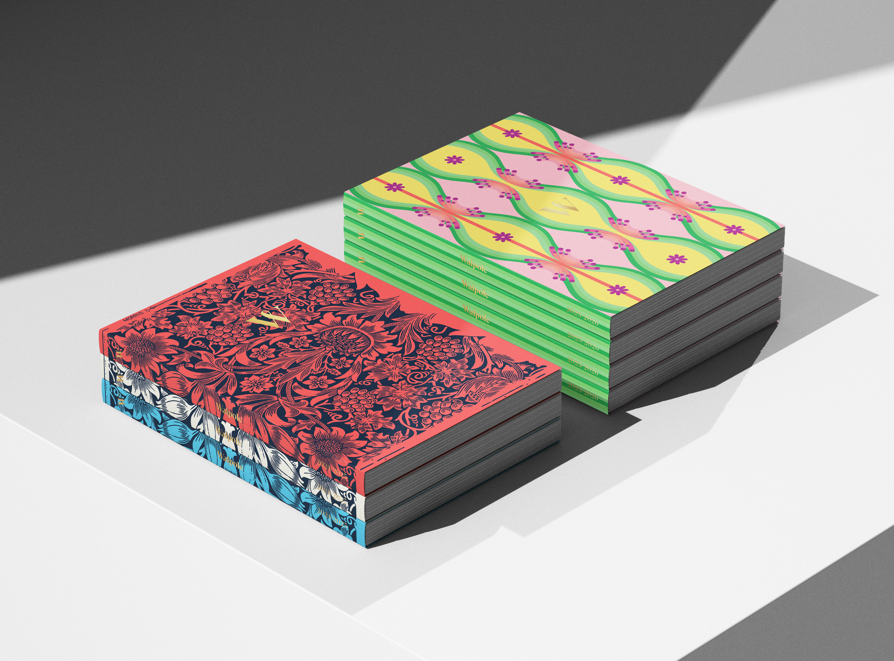
Proudly, this is our eighth issue of the Book of British Luxury. Our first, in 2018, featured a Rory Dobner lion and marked a turning point for the industry, when conversations around sustainability, ethics, and craft truly began to shape how luxury was defined and communicated resulting in a quieter, more considered British luxury.

Walpole recognised this from the outset, and the following extract from the original 2018 brief encapsulates that vision, one that still guides our approach today: 'We want to avoid a wall of noise. We’d like the 2018 edition to feature changes of intensity and layout flexibility, allowing the reader to feel the landscape shift and experience an element of surprise when turning the page. Luxury isn’t chock-a-block or super-busy; there needs to be space – white space – to allow for elegance and contemplation.'

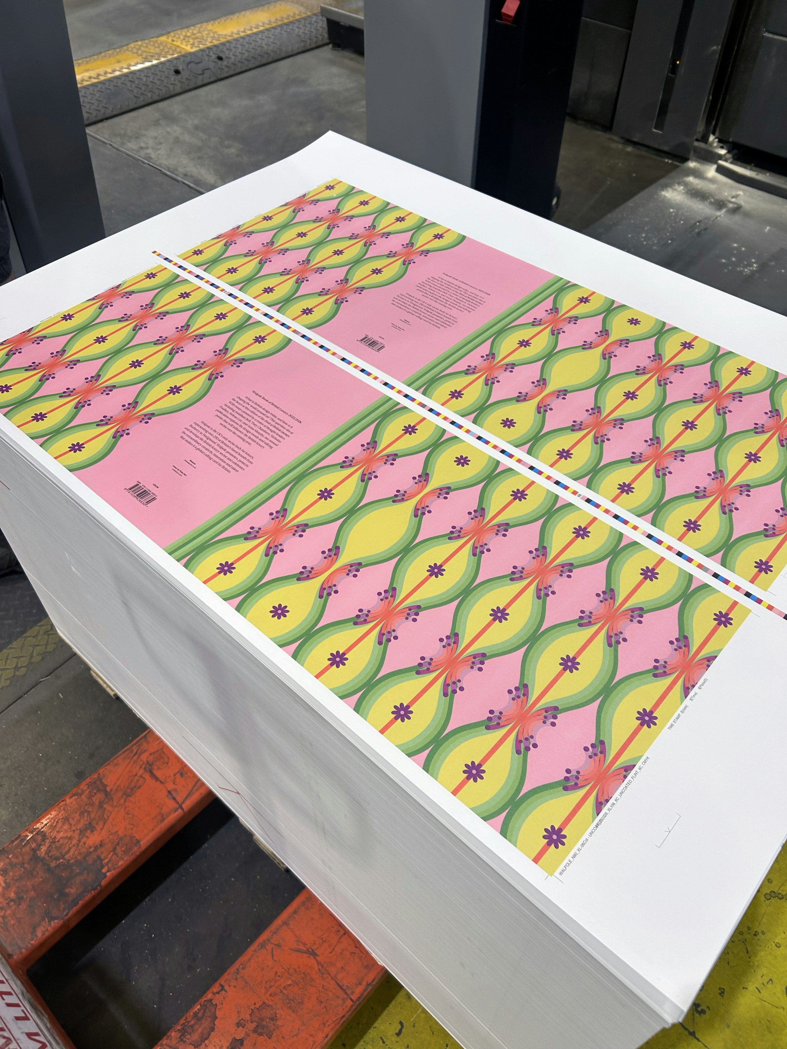
From a design perspective, our approach has evolved alongside the industry. Issues one to five were produced in a larger, tome-like format, consistent with the legacy of the publication. While we debated the practicality of that size each year for cost and sustainability reasons, the pandemic became the catalyst for change: the book needed to fit through the domestic letterbox. In 2021, Walpole’s complete identity overhaul by Nous brought a new set of guidelines that helped refine the visual language further, elevating the publication into an even more sophisticated and professional piece.

Each issue since has been stronger than the last, not only in design, but in editorial depth, print finishing, and the broader representation of British luxury itself. It’s a testament to Walpole’s team, their vision, and the continued evolution of the industry we have the privilege to represent.

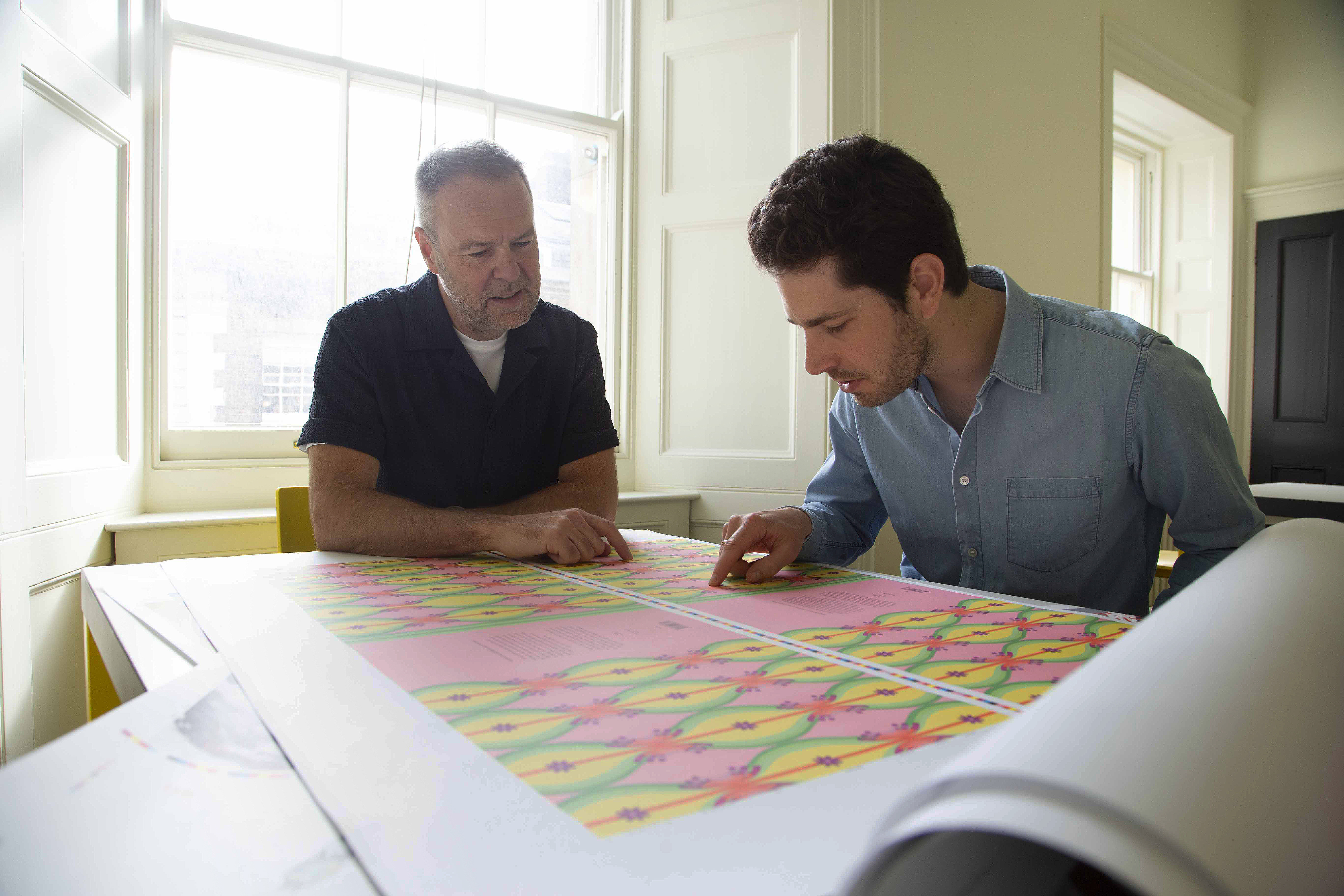
How long does it take you to design one issue start to finish?

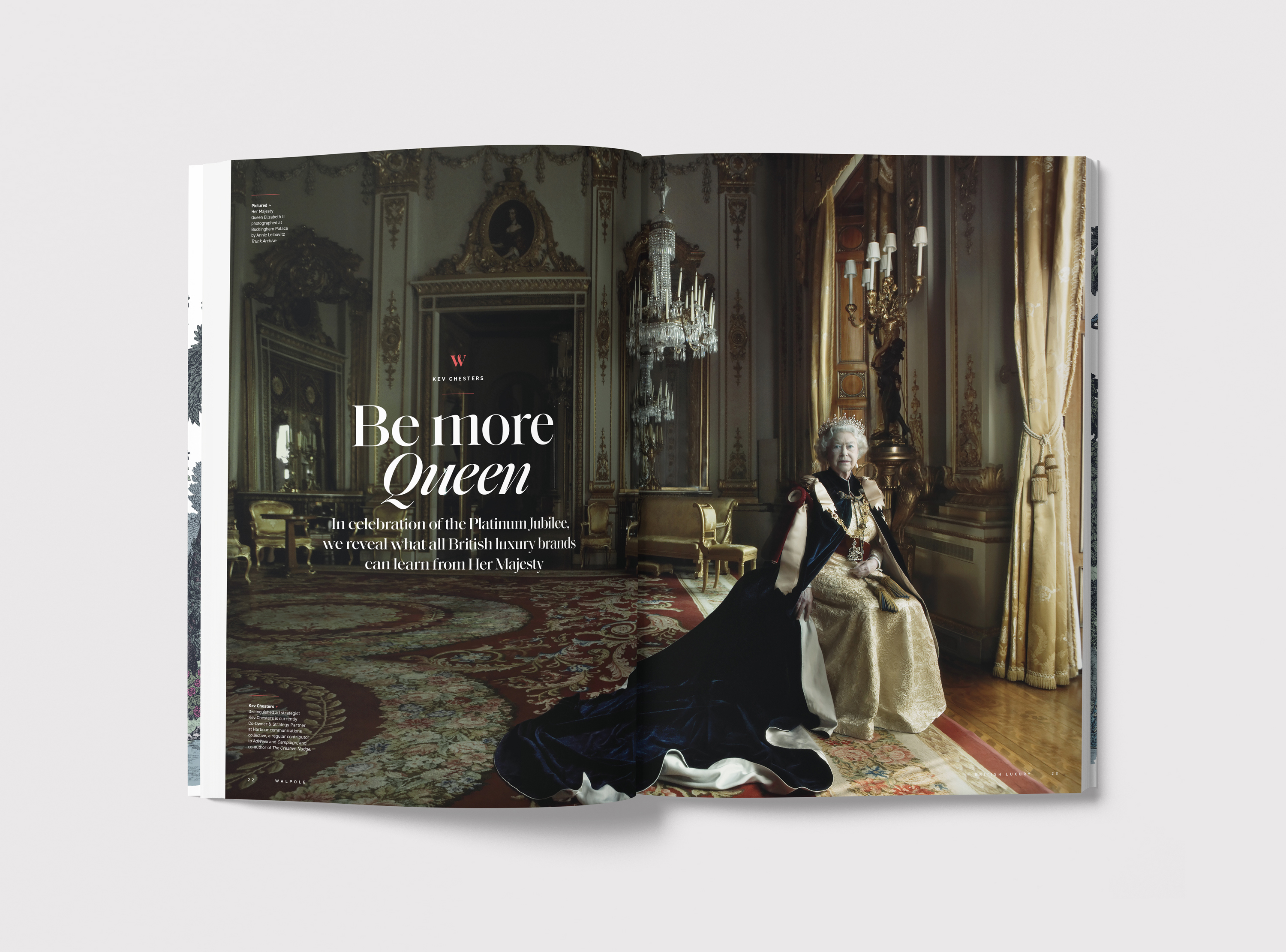
It usually takes about six weeks from start to finish. I say 'about' because there are so many moving parts. We plan and commission everything ahead of time, but when it actually lands, you want it to feel current – and still hold up a year later until the next issue drops. A lot can shift editorially and politically in that time. I mean, we’ve had five prime ministers and a global pandemic while working on these books, so we’re always making sure the layouts feel right for the moment. For example, in a previous issue, we featured the quiet power of Queen Elizabeth II, and it came out just before her passing. If we’d gone for something playful and light, it would’ve felt really off. Instead, the lead image, shot by Annie Leibovitz, carried such a sense of calm and dignity. Looking back, it just feels powerfully beautiful.

'Be More Queen' feature in the Book of British Luxury 2022/2023

What is the character of the publication and how does that influence your design?

The Book has a pretty mixed audience, though it’s not really aimed at youth – we’re typically talking over 50 for the CEOs, stakeholders in their 30s and 40s, and brand customers. So the design has to feel contemporary, relevant, and energetic, but never forced or edgy. British luxury has this really distinctive eccentricity – a bit of quirk, a playful streak, and a hint of maverick spirit. You can see it in William Morris, Winston Churchill, Gilbert & George, Zaha Hadid, David Bowie, all of them have that rare mix of confidence and individuality. What’s interesting is that a lot of British luxury brands are actually quite young, many founded in the last 40 or 50 years, yet they’ve somehow picked up the gravitas of heritage without feeling stuffy. That’s exactly the balance we aim for in the layouts: polished, confident, and always with an unexpected lightning bolt of personality.

Which element of the design of the publication are you most proud of?

What I’m most proud of is seeing how the design has evolved over time, especially the editions beyond the new brand identity. It’s amazing to see the same graphic language flow seamlessly across every Walpole touchpoint, from the Book to the website to Helen's business cards. If I had to pick a favourite, it would be the editorial pages, a section of the Book called the 'Luxury Landscape'. That’s where the design team and I really get to have fun with the layouts. We still keep it grounded for the serious CEOs, nothing too 'out there', but it’s the space where we can inject personality, playful touches, and little surprises that make the pages feel alive.

The two most recent issues of the Book of British Luxury, with this year's edition on the right

What is your highlight of the design process?

The highlight of the design process for me is collaborating with the artists commissioned to create visual assets for the Book. The editorial columns often call for illustrations that act as abstract metaphors for the ideas being explored. But the cover has been the most rewarding part, working with a diverse set of creatives to design the decorative outer layer of each book. To name just a few: Timorous Beasties, House of Hackney, Sabina Savage, Wedgwood, and most recently Yinka Ilori. Each brings their own flair, giving the book a truly distinctive personality every time. Our process really allows for collaboration, letting the book be guided to the benefit of creative expression. Once it’s ready for print, we work closely with Greg at Paragon, running a series of tests to elevate the design and make it truly sensory. He knows everything about print, and together we find solutions that bring the beautiful G F Smith papers to life.

The Book cover hot off the printing press at Paragon

What makes a truly luxury publication to you?

For me, what makes a publication truly luxurious is that it’s in print, and that alone sets it apart. In today’s world, where acquisitions, tariffs, and cost-cutting are on everyone’s agenda, print often bears the brunt of the reductions. That’s both a blessing and a curse, because it creates a unique space where print can really stand out. Of course, we value, love, and invest in digital at our agency, but print is the most immediate way to create that true feeling of luxury, one that appeals to all the senses. Luxury, at its heart, is an emotional choice, instinctive rather than logical. It’s in the subtle cues that speak to craftsmanship, quality, and intention. Print, with its texture, weight, and presence, engages the senses in ways digital never can. It doesn’t just show brand values, it makes you feel them.

Take a closer look at the latest issue of the Walpole Book of British Luxury 2025/2026
Find out more

Enquire about Joining

Forename*
Surname
job title
email*
Brand*
TURNOVER
message*
Thank you. This form has been submitted

Membership Fees

Membership Tier
01
02
03
04
05
Brand Turnover
£5-10m
£10-20m
£20-40m
£40-100m
£100m+
Membership Fee
£7,000
£10,000
£15,000
£22,500
£36,000

Membership Guide

Please provide your details to download this document

Forename*
Surname
email*
SUBMIT
Thank you. This form has been submitted
Oops! Something went wrong while submitting the form.
Get the latest luxury talking points, sector news and industry insights in your inbox each day by signing up to our newsletter, the Daily Luxury Digest.

Daily Luxury Digest

Sent every working day, the Daily Luxury Digest is your essential news source for the latest developments in the luxury sector both in the UK and around the world.

Thank you! You have been subscribed to the Daily Digest